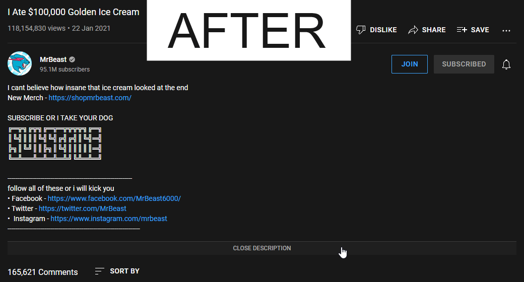
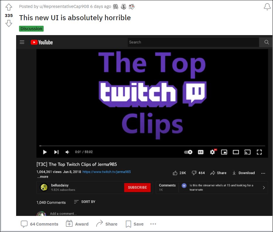
The first tweak makes the UI more compact, wherein it tends fit in the plethora of options under one small roof. As a result, the video description, likes, dislikes, clip, share, save, the overflow icon, the subscribe button, and the comments bar have all been smushed into one small section. Moreover, when you click on the comments bar, it will open that section at the right of the screen as opposed to the bottom. This tends to end up ruining the theater mode viewing experience as well. On the other hand, some users have received a slightly different UI change wherein the video description section is sent to the right of the screen. Both these changes are something that users didn’t ask for in the first place but are now left with no choice but to stick with this UI. Or is that really the case? Well, there does exist a nifty workaround through which you could bring back the old YouTube UI layout. And in this guide, we will show you how to do just that. Follow along.
Bring Back YouTube Old UI: Send Comments/Description at the Bottom
So were the steps to bring back the old YouTube UI layout. It’s never a good change to begin with, when a user has to rely on a third-party script to revert a change that has been intruduced by the developers. But that’s the way it is for now and we don’t see there being any changes either.
Moreover, if this feature is going through a testing phase, then a much better approach will be to carry out this test in a closed environment with only the beta testers as opposed to rolling it out for the stable users. Or if they had to include the general audiences for a mcuch larger sample unit, then you should have atleast given us a toggle to enable/disable this change. But unfortunately, that isn’t the case and a third-party script is our only dependency.
How to Disable YouTube Most Replayed FeatureYouTube Videos Missing Upload Date: How to FixBring Back Sort By Date Added Oldest option in YouTubeHow to Remove Shorts from YouTube Website
About Chief Editor


